After a little searching, I found that there are actually 13 more players that are featured in both the 1996-97 and 2012-13 Metal Universe sets. Since these just came out, it was actually pretty easy to track down scans of all the new stuff on eBay. Between these and the other three I showed, this would make a cool little side project, or at least a good way to start going after the 2012-13 cards.
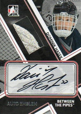
Here are both versions featuring Dominik Hasek. They both show him with the Sabres. It looks like the new version has a picture of him from a later season based on his equipment.
Martin Brodeur is one of the few from the original set that still play in the NHL. His original is one of my favorites from the set and the new one is pretty cool too.
The next pair features Pavel Bure of the Vancouver Canucks. It looks like the 2013 version has an older picture than the original, based on seeing the 75th anniversary patch.
Similar to the Bure, the 2013 version of Ray Bourque's card has an older picture than the original. In this case I have to say I like the original background a bit more than the new one.
The next pair both have Doug Gilmour with the Toronto Maple Leafs. In this case, I can't tell if the picture on the newer version is from the same season or not.
Here we have Brett Hull, shown with the St. Louis Blues on the original card and with the Dallas Stars on the new version. I kind of like the look of the new one a bit more in this case.
Here's another one where two different teams are featured. Unlike the Hull, I think I prefer the original background for this one. The colors are just a bit more vibrant and stand out nicely. Plus its always fun seeing a mullet on a card.
Yet another pair featuring two different teams. Koivu was originally shown with the Canadiens where he started his NHL career, but now is with the Ducks. I'd give the new version the edge here when it comes to the background design, but just by a little bit.
Here's another one where I just love the background on the original. This is what these cards should look like. Seeing the new version, which is still pretty nice on its own, next to this one makes it seem that much better, doesn't it?
Messier is another good example of the differences between these two sets. On the left you have a sweet looking castle wall looking background with smoke rising from the bottom. On the right is a simpler design that still complements the picture quite well.
The original Sakic is an example of a design that was repeated, as evident by the Lemiuex from my last post. Not sure if any of them were repeated in the new set, although it appears they are all unique. That makes sense since the new set is just 60 cards.
Here is an example of a night and day difference between the two versions of this set. The original Selanne on the left has a bright and obnoxious background, while the new one is darker and bit more subdued.
The last pair features Mats Sundin, shown with Toronto Maple Leafs on both versions. In this case I have to give the edge to the new version, just because of the better picture choice and a more diverse looking background.
After seeing all of these side by side, it seems like they tried to tone down the background designs a bit for the new versions, would you agree? I also noticed that none of the new ones seem to cover up any of the player image, where several of the original ones did. The best example is probably the laser headset on the original Marty Brodeur card.


